Asthma Action Plan
Background
During my time at Halton Healthcare, I had the pleasure of iterating concepts and working at the Asthma Education Centre with a Respiratory Therapist to create a new asthma action plan to be used by doctors and patients.
An asthma action plan is a management plan, written by a patient's doctor, to help control one's asthma. The goal of this plan is to reduce and/or prevent flare-ups and visits to the emergency department. Asthma symptoms vary from time-to-time and between various situations. This plan allows modifications, as needed, for every scenario which could further trigger asthma. Each patient's asthma is unique and requires their own plan.
According to the Asthma Canada Board, "Studies have shown that having a written agreement with your doctor helps you manage your asthma at home." It is cruical that this agreement is clear, painless to adhere to, and easily accessible for both the patient, their doctor, and for other medical professionals in the case of an emergency.
Research & Problems
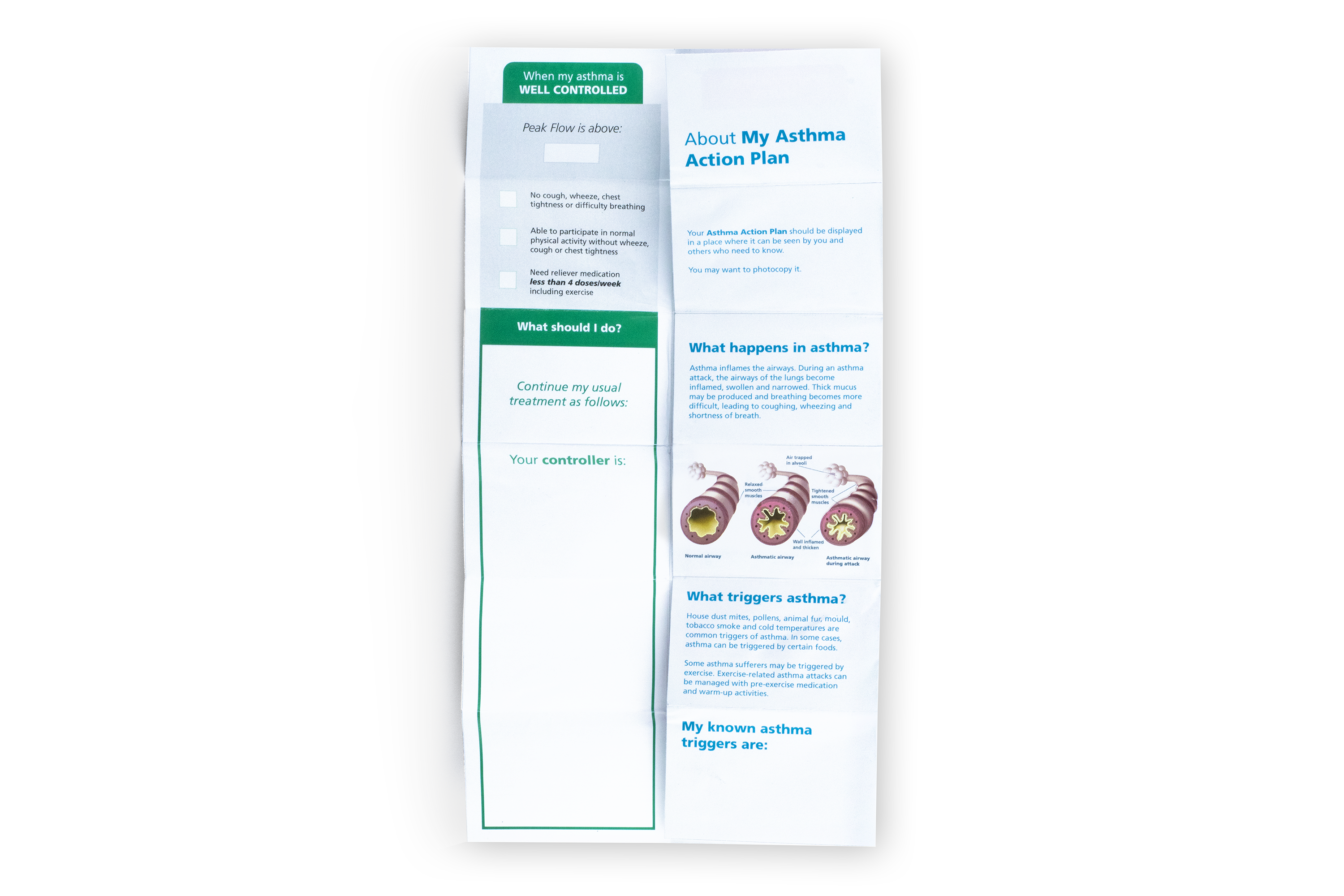
The design of the asthma action plan should notify the patient on what action to take when their asthma is either under control, moderate, or beyond their control. It must also indicate the medications and inhalers they use during each phase and any additional instructions.
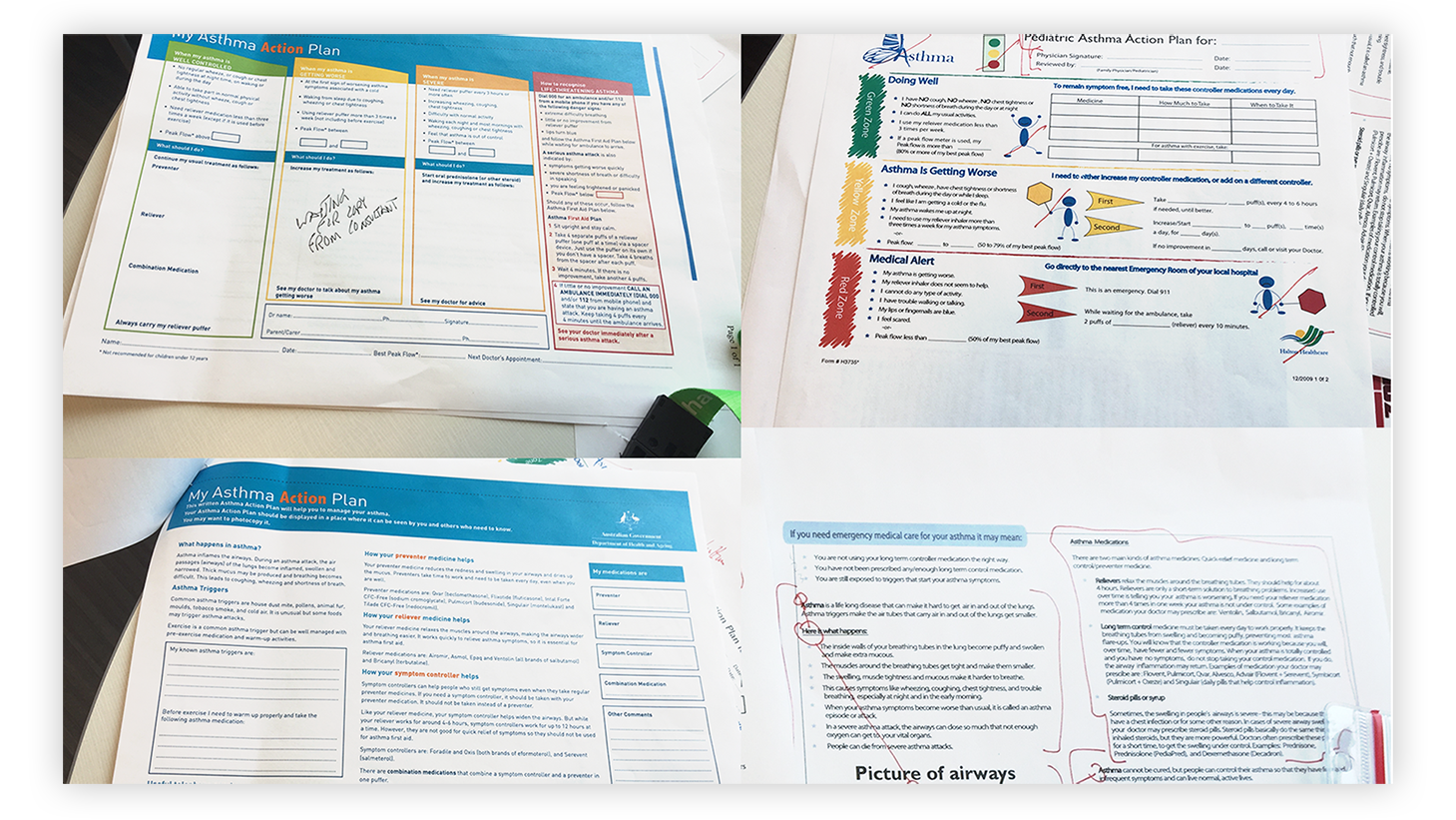
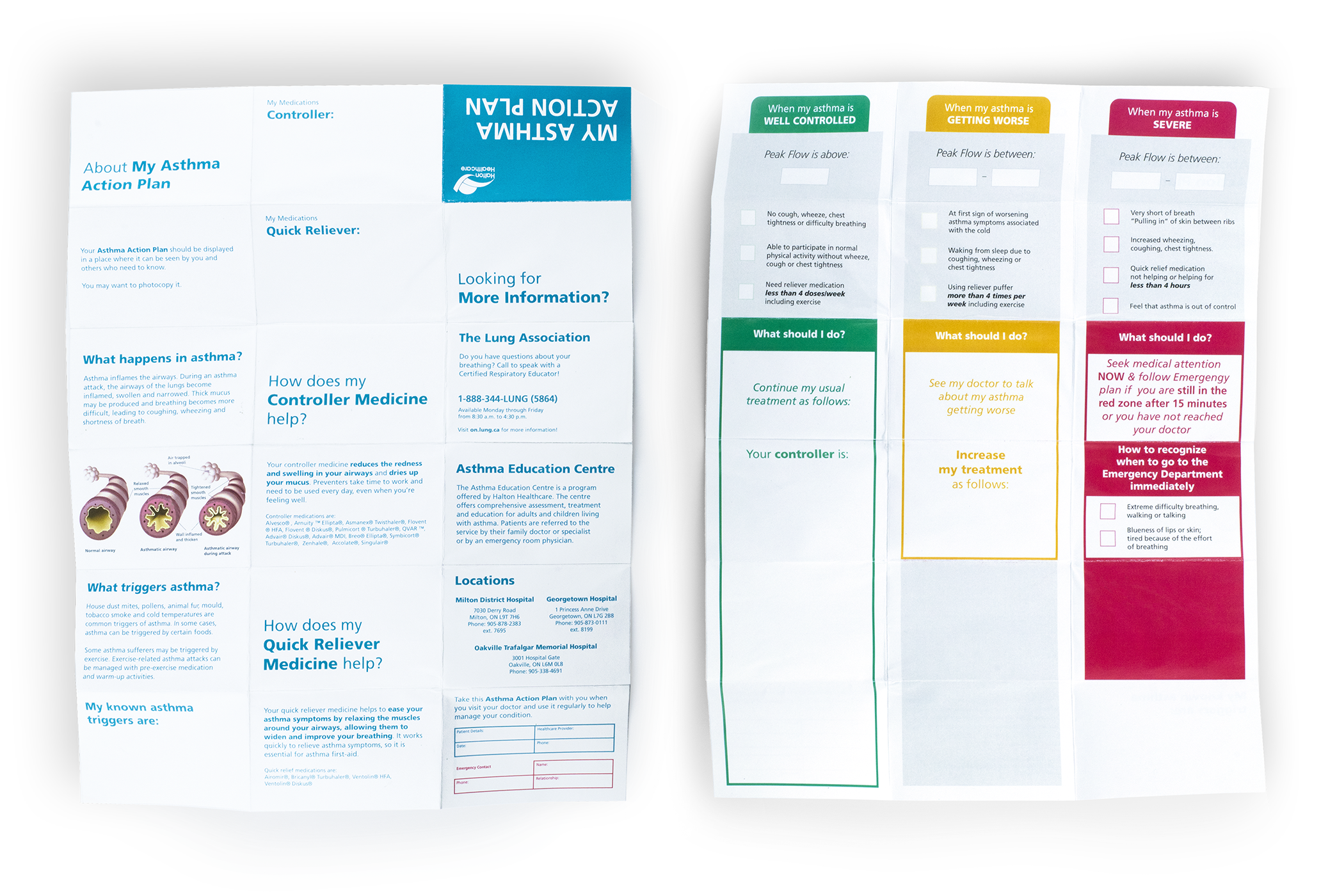
As Halton Healthcare has recently rebranded, it was necessary to update their asthma action plan to adhere to brand standards. At the time, their current plan (top right) was outdated, unclear, and contained too many unnecessary visual elements. In the informational section (bottom right), it had no visual elements but was too dense. Having too many useless images with no overarching reasoning and information that was not paced well results in a poor patient experience.
Looking at other asthma action plans that are currently used, such as the one by Asthma Australia (top and bottom left), their information is organized into colour-coated columns and is well paced across the entire document. When looking at the informational side, it is split up into questions with answers no less than a few sentences.

Redefining the Plan
While many examples of current asthma action plans use letter sized paper and given to patients to hold onto in case of a medical emergency, there are a few issues that revolve around this. Firstly, patients are encouraged to carry this unportable and very critical document around at all times. It is difficult to find a place to carry such a document, and poses the possibility of it either getting lost, destroyed, or just not carrying it around for the sake of inconvenience.
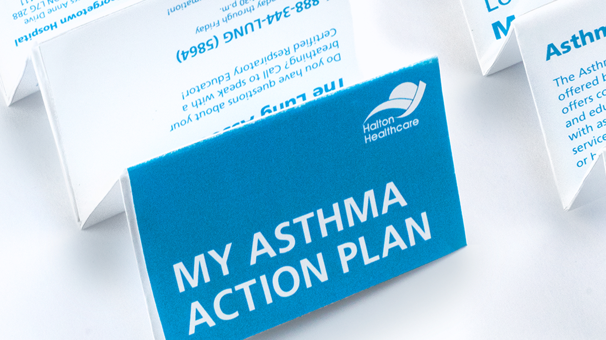
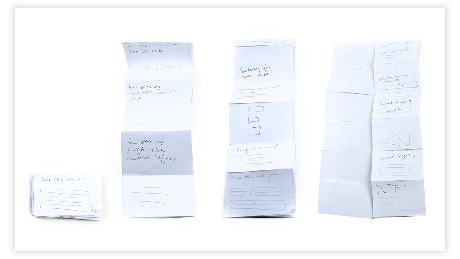
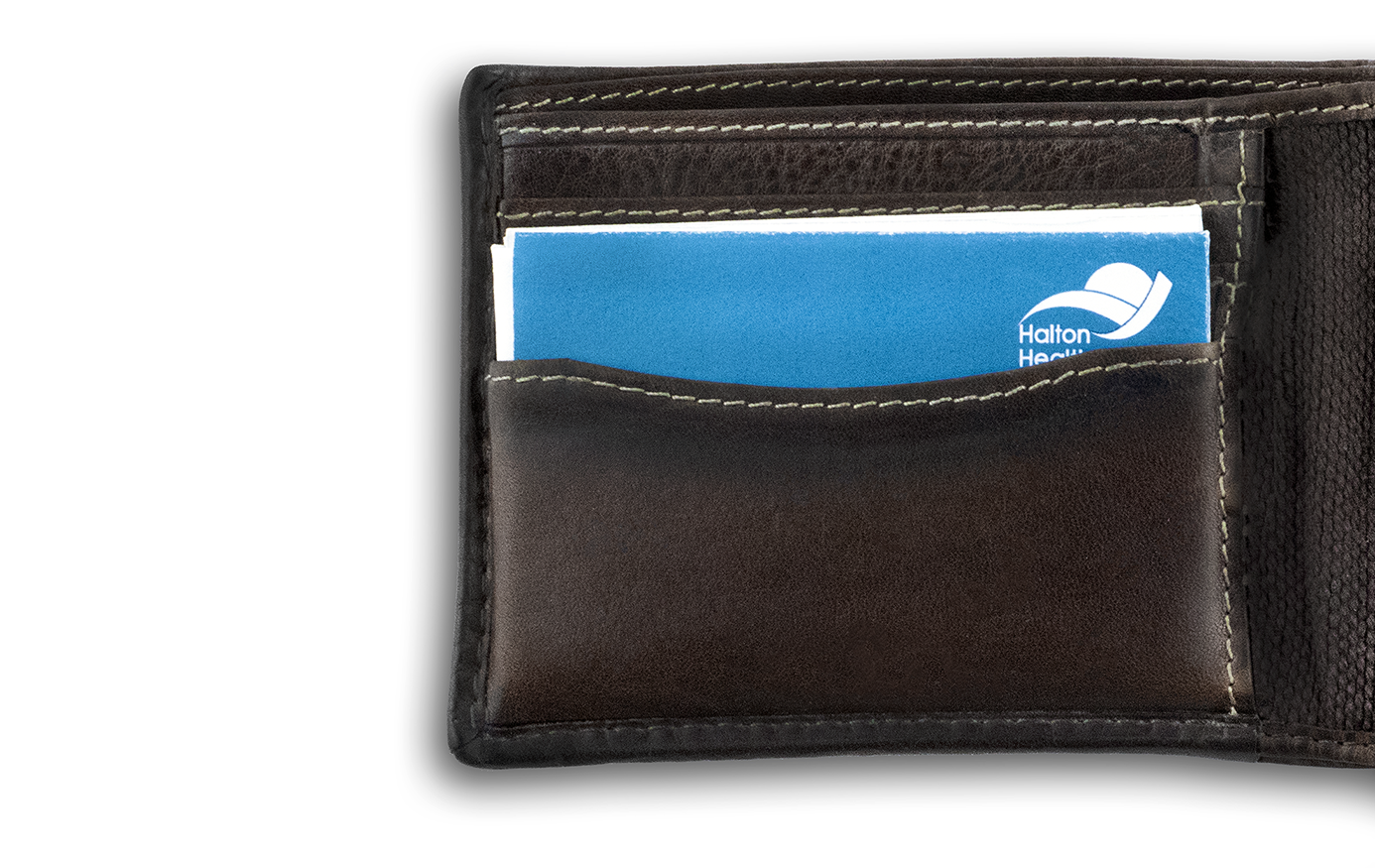
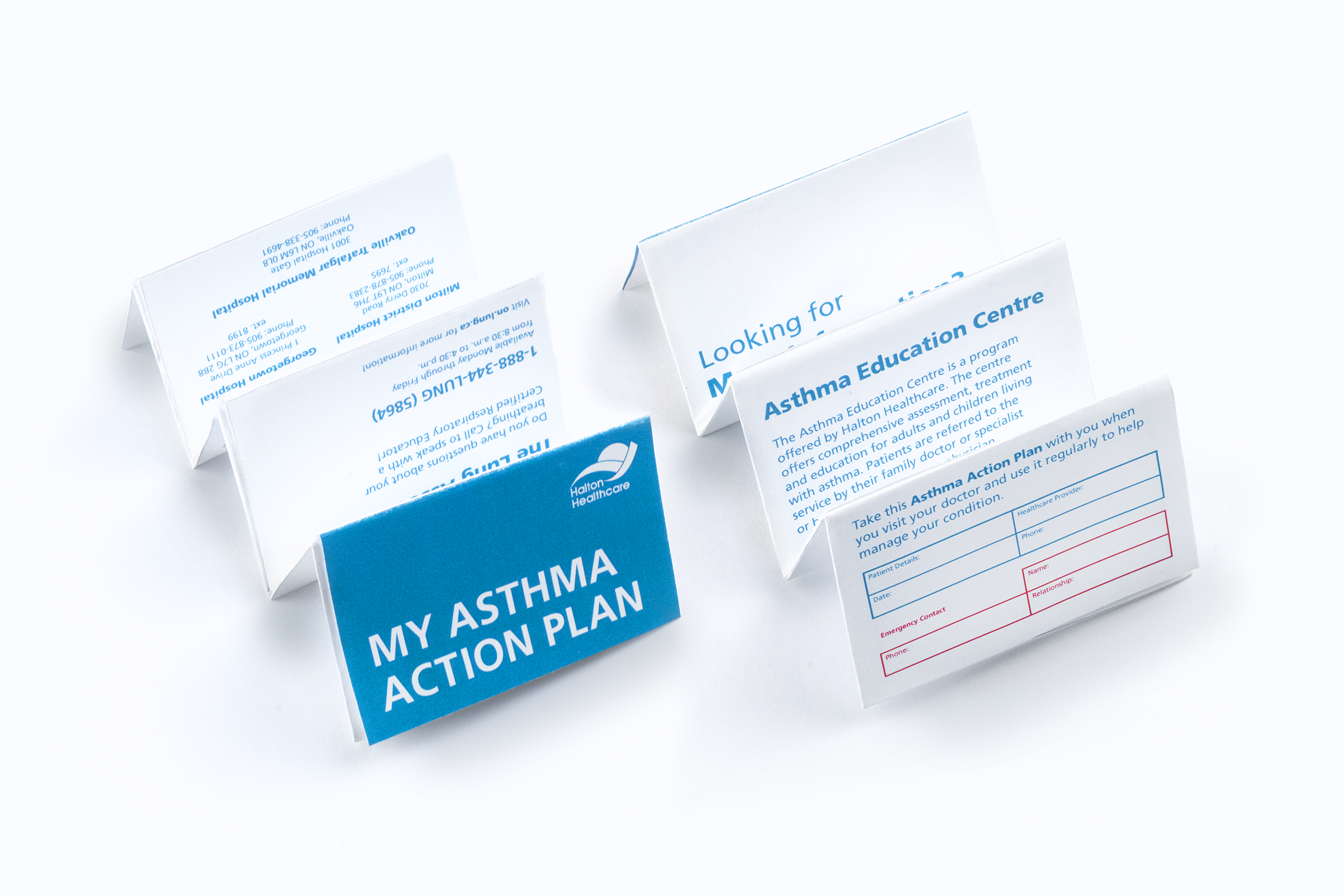
A solution I proposed was creating a portable z-card, where patients can carry their plan in their wallets. This is convenient for patients and for healthcare professionals to access in case the patient is unable to during an emergency. One side of the card will have data on the patient's asthma, and the other side will have FAQ and more general information on the topic of asthma itself and Halton Healthcare hotlines.
Refined Prototype
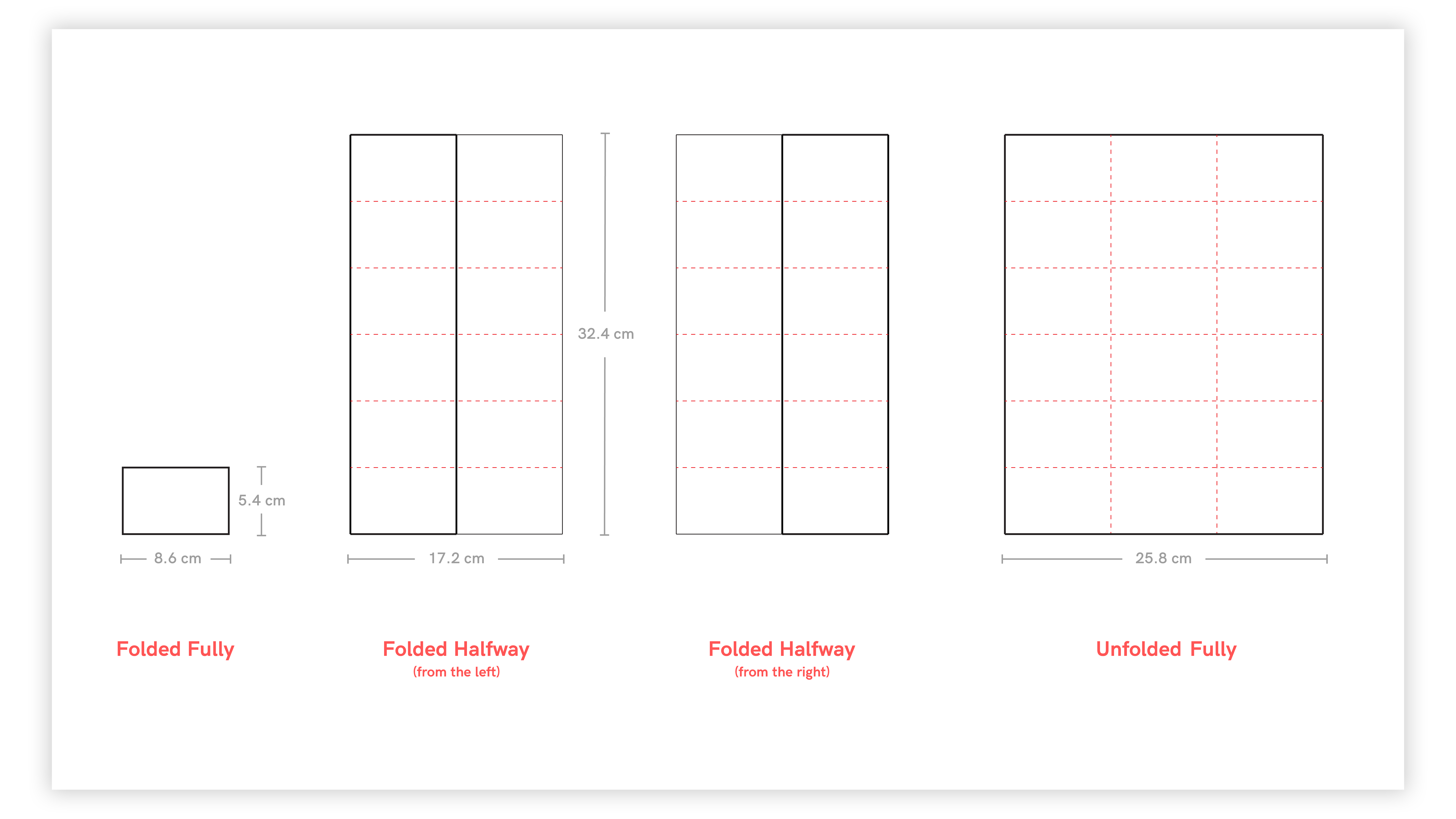
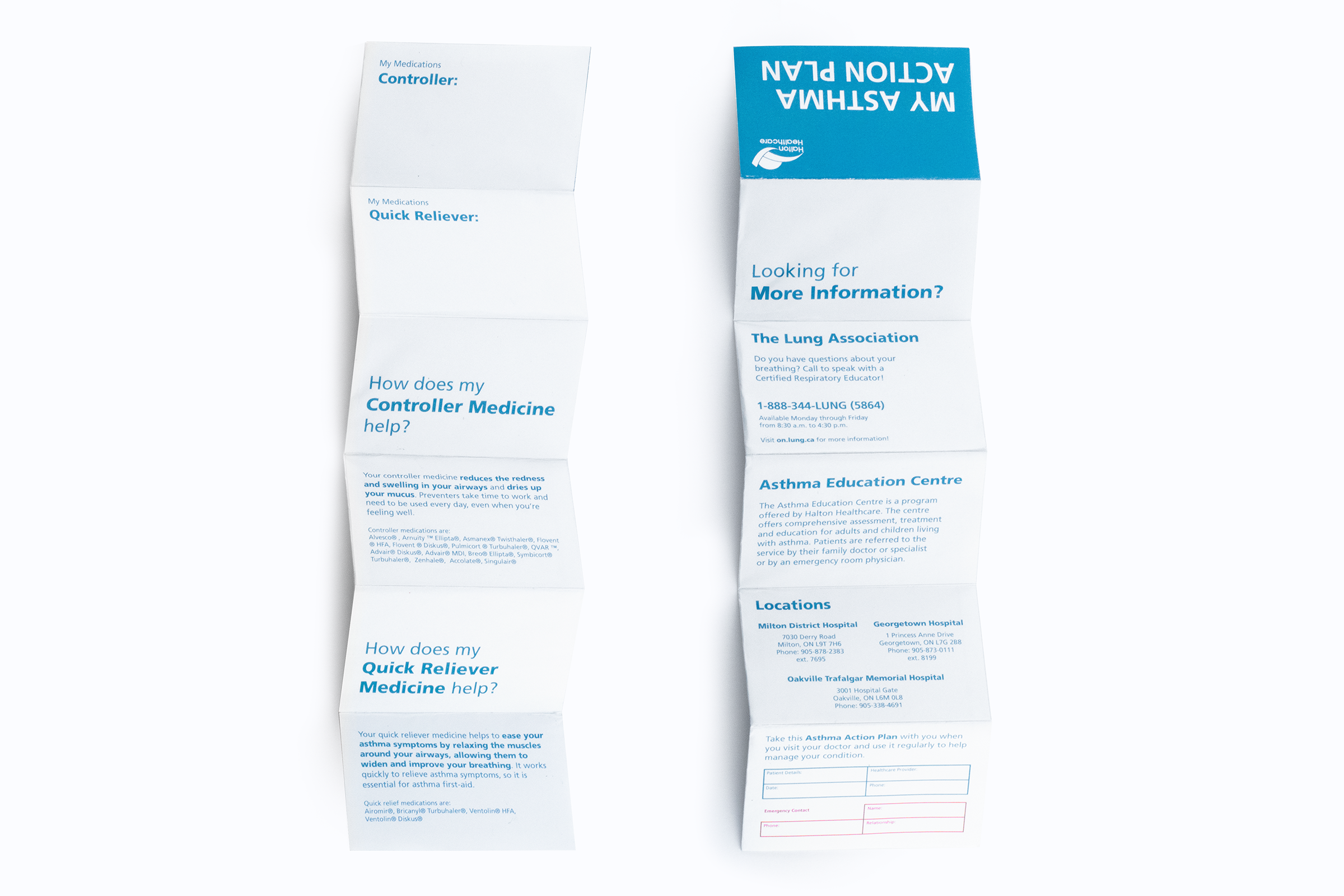
Using the current Halton Healthcare graphic standards, the z-card asthma action plan was created. The card fold out features 3 stages of what to do when the patient's asthma is either well controlled, getting worse, or severe, and medication for each stage. The card can be opened up to any 8.6 x 5.4 cm face to attain any information about the patient.
The z-card snuggly fits any typical wallet, as it is sized after average credit card dimensions. On the front, the Halton Healthcare logo is featured and is the most prominent feature that sticks out of the wallet. When taking out the card from the patient's wallet, the patients name, healthcare provider, and emergency contact information is given.
Not only is this asthma action plan portable, but it is easily accessible for emergency contacts and medical professionals to reach in the time of an emergency. All patients simply need to do is place the z-card in their wallet after their appointment with their doctor, and they never have to think twice about carrying it, as everyone always carries their wallet with them at all times.
The Outcome
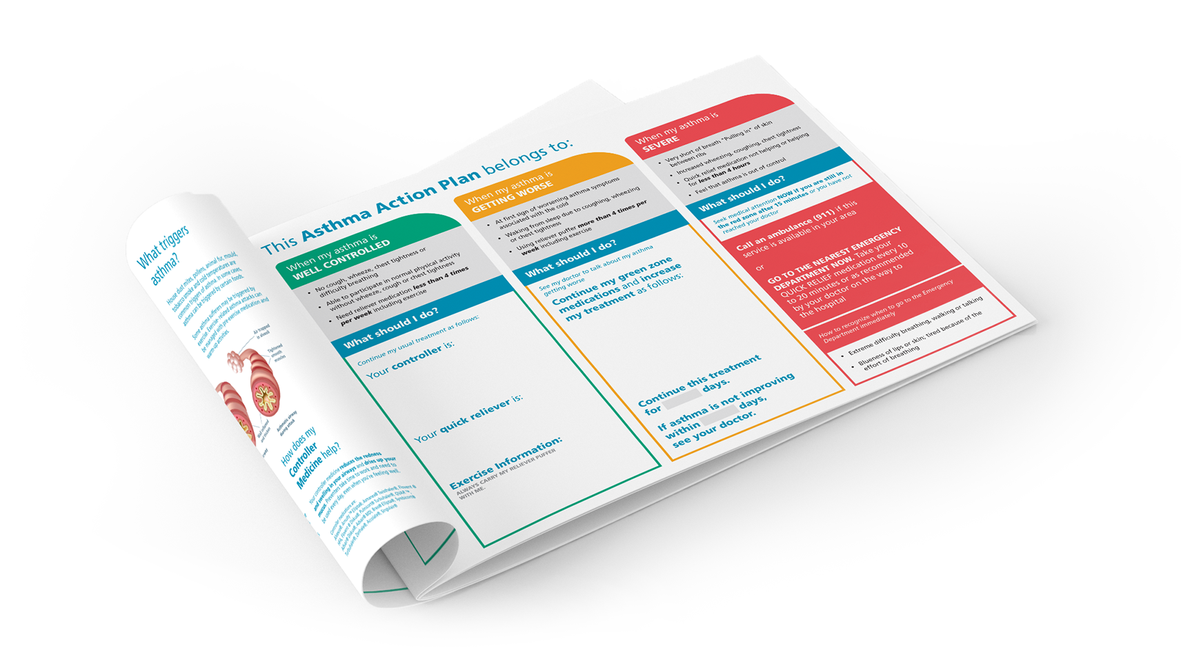
After presenting to the client, they evaluated that the cost to produce and teach the client “the z-card method” was too time consuming and costly for the doctor. We then created various letter-sized versions and reduced the amount of body copy they wanted to create a final product. The client wanted a double-sided tear-pad in landscape format so the therapists and nurses are able to write across the page easily. We kept certain elements such as the design of the 3-column page, its colours, and some of the information on the back page.
-
AcknowledgementsThank you
- Paul McIvor
- Emma Murphy
- Halton Healthcare
Credits- Visual Mockup Authors