Queen Elizabeth Park Community Centre

The Design Challenge
For my User-Centred Design: Prototyping and Usability course at the York University/Sheridan College Program in Design, my design group was approached by a few staff members from the Queen Elizabeth Park Community and Cultural Centre (QEPCC), located in Oakville, Ontario, who briefed us on a user experience problem they were facing. Many studio members and customers were having trouble navigating their online scheduling system. Also, their many schedules, suited for specific memberships, would conflict with each other and would not be presented as a problem online. And so, they presented us with the question: As a studio member, when can I access the studio?
The Problem
Not only do studio members and customers of the QEPCC experience frustration navigating the website, but so do the staff members. Since it is difficult to book courses, members resort to dropping into the centre. Currently, there is no implemented system to check the drop-in schedule. Therefore, if the rooms are full, they have no other choice but to return home. As a result, members resort to phoning into the QEPCC each time before their visit, where staff must call in a supervisor in the drop-in room to check if there is any more availability. This process is complicated and stressful for both customers and staff. Additionally, the map on the website does not specify room locations. When clicking the map, it only shows where the centre is. You must ask to recieve information on where the room is located.
Site Visit & Interviews
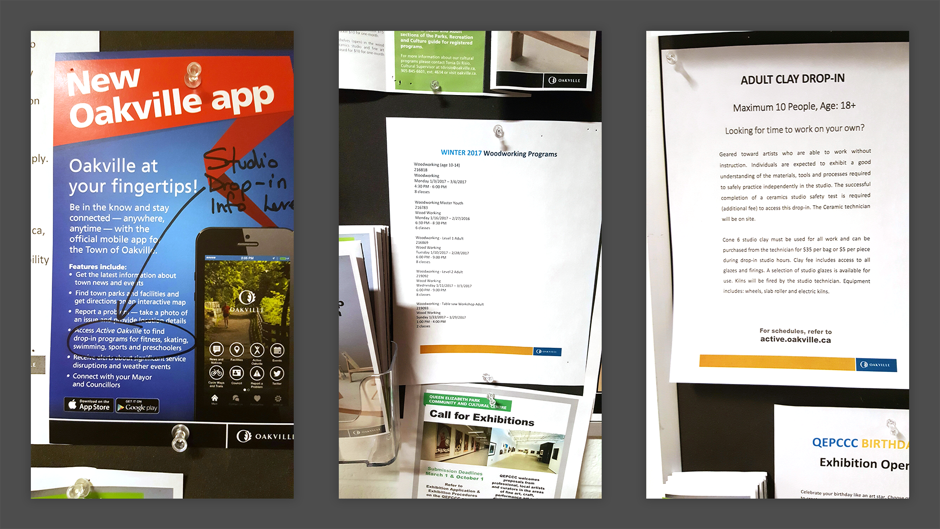
As my group visited the facilities of QEPCC, we noticed that it was extremely difficult to navigate. There was no wayfinding or maps, and most customers would simply stop by the front entrance just to ask for directions at the front desk. We also found that members rely on hand written notes or typed-up paper that were posted either around the building or on the front doors of the studios. Customers must either search hard to find the information they are looking for, or constantly ask the front desk for assistance.
As a group, we also learned about the target audience: Busy moms, impatient seniors, and those who were not very tech savvy. It started to make sense as to why members would easily call in or visit the QEPCC instead of checking the overly complicated website.
Outlining the Objectives
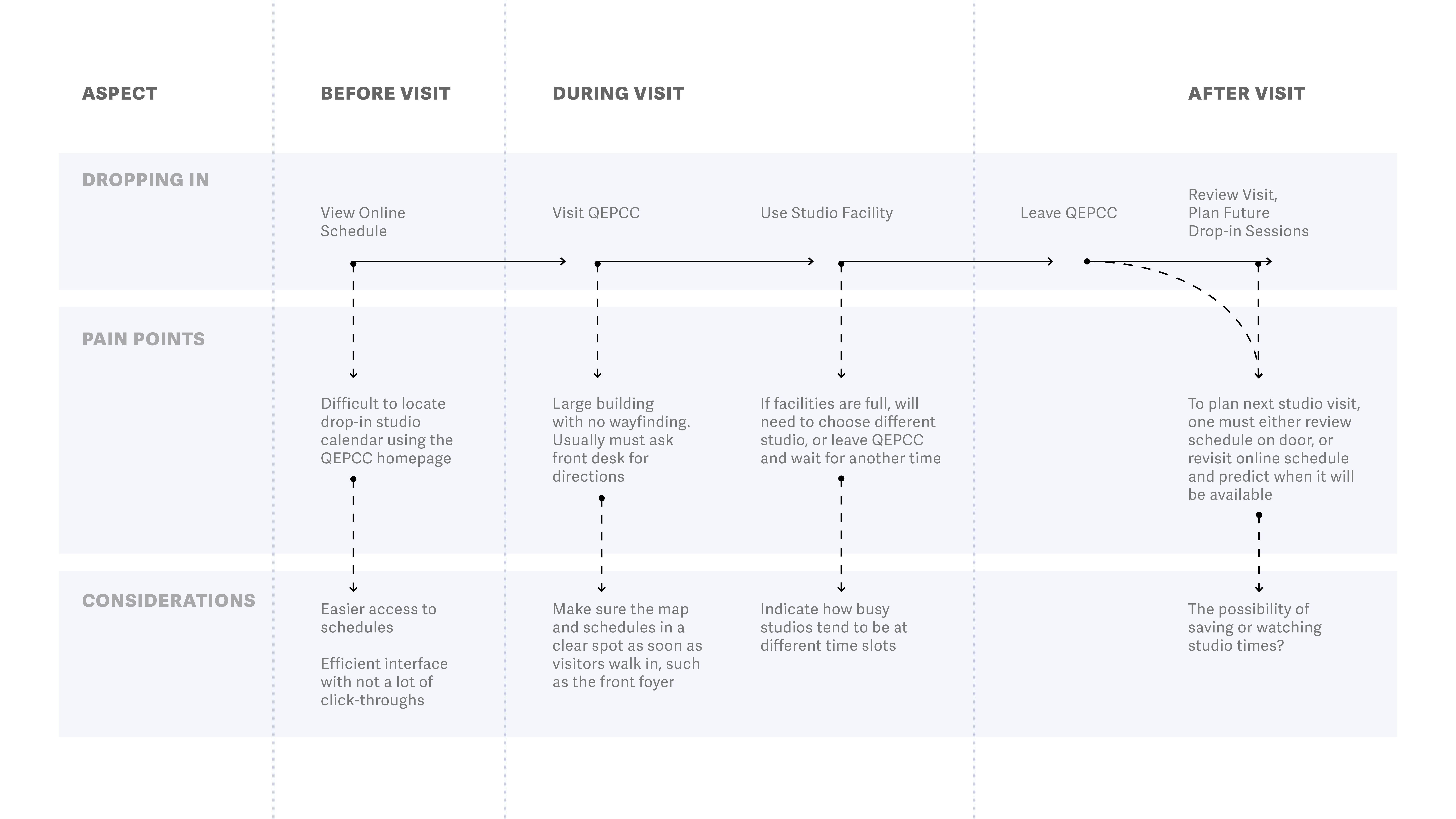
Tracing a journey map through a member's experience helped us understand pain points and considerations for improvement of their current system. In addition, learning about the target audience and the behaviours of customers helped us establish a new way of approaching a solution. As a group, we decided to create new deliverables to improve the QEPCC experience:
ON-SITE KIOSK: A simplified way to check drop-in schedules right at the front entrance. The kiosk would offer users notifications, through text message alerts or e-mails, if any updates arose, such as full occupancy or cancellations. This would eliminate the dissapointment of arriving to the facility and learning they cannot enter. Also, a map feature would help on-site users quickly search for the studios they wish to visit.
UPDATED WEBSITE: By simply improving the functionality and visibility of information on the current website, such prices, dates, times, occupancy, and more, tech savvy customers are able to use the site from the comfort of their home. The website would also offer mobile notifications, like the kiosk, and can be used on-the-go.
Both interface experiences offer the same functionalities for two target audiences: Those who spend a lot of time at the QEPCC and are not comfortable with navigating through a website, and for those who need information very quickly and on-the-go without any obstacles.
User Scenarios
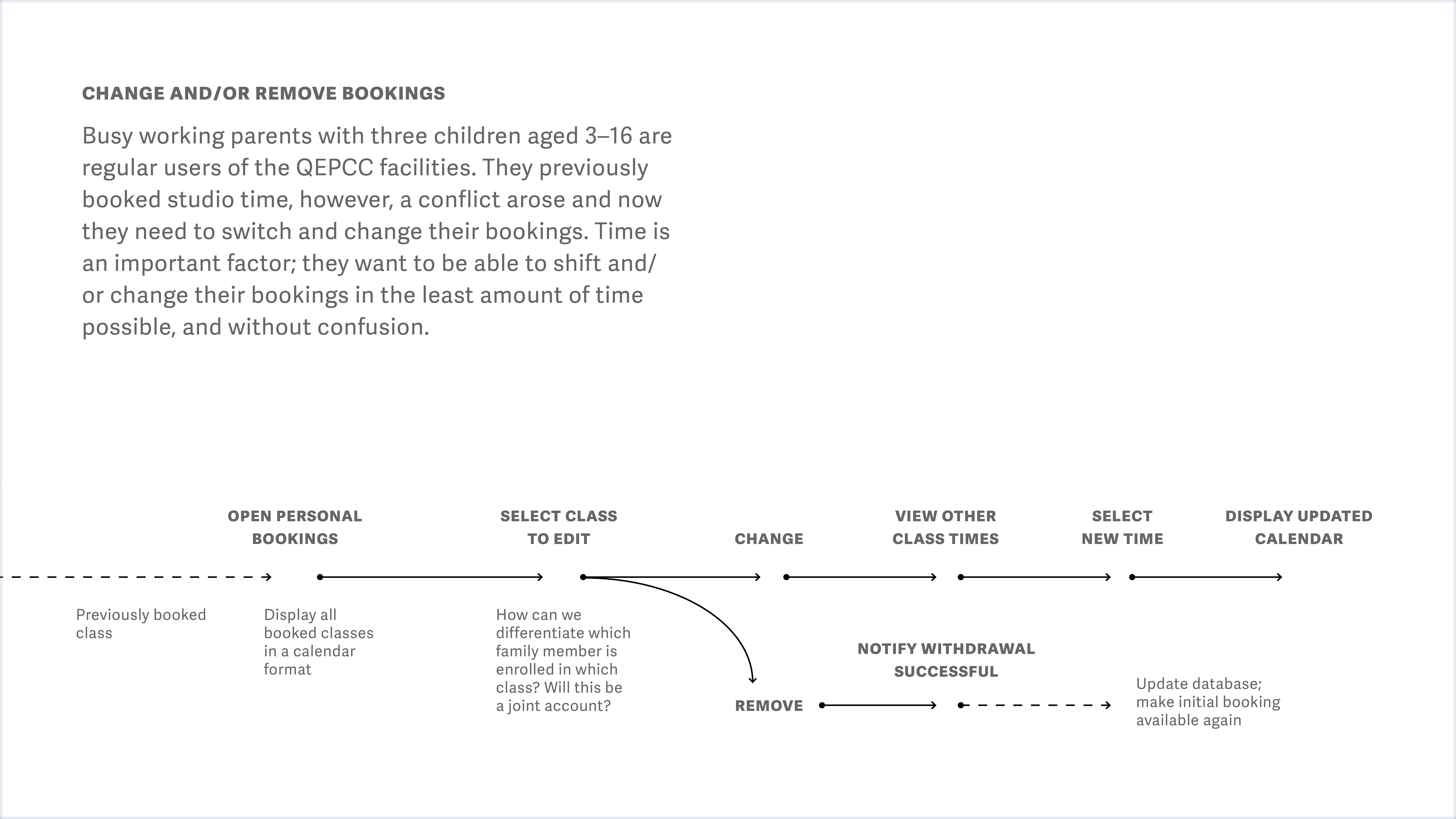
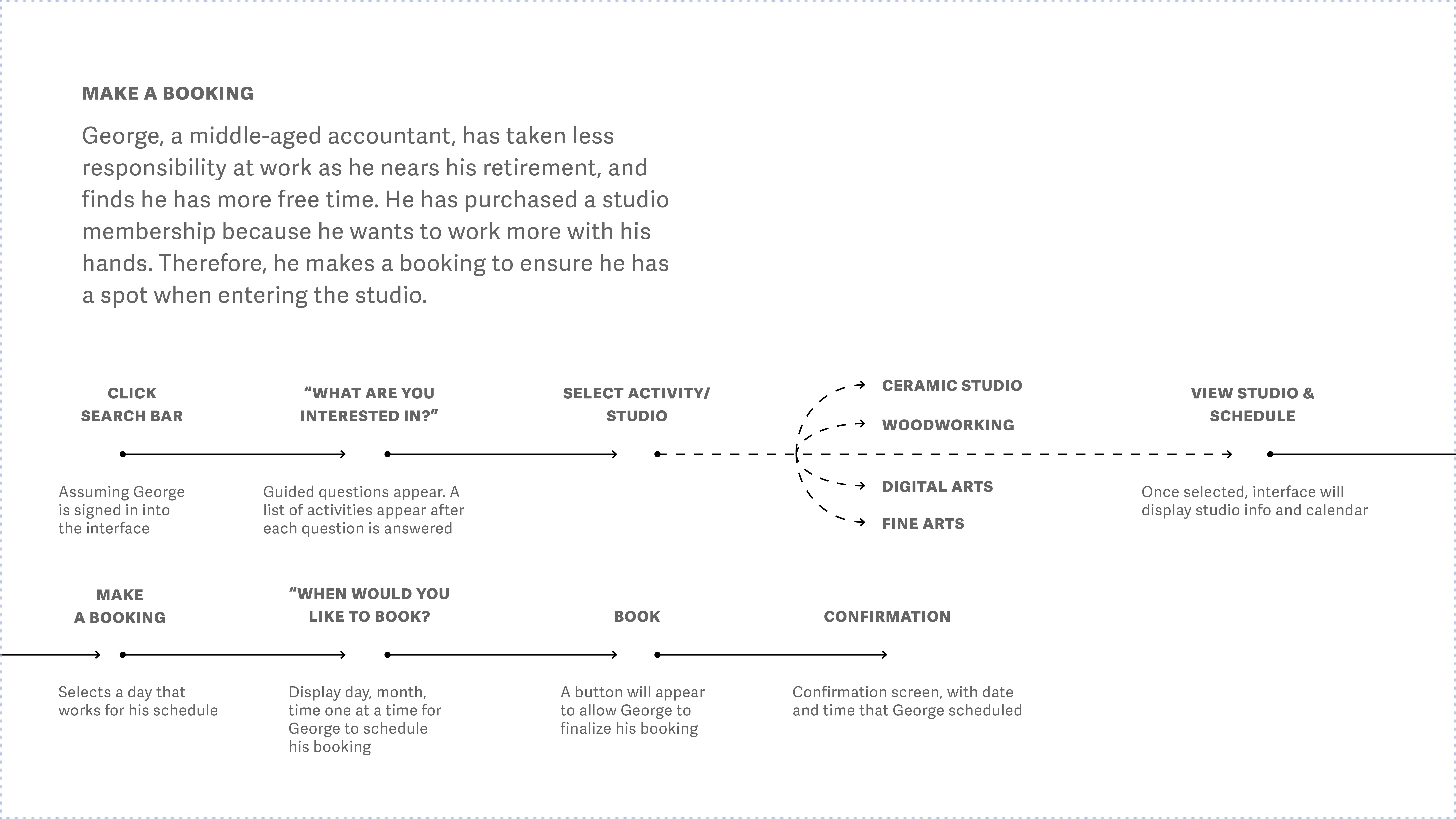
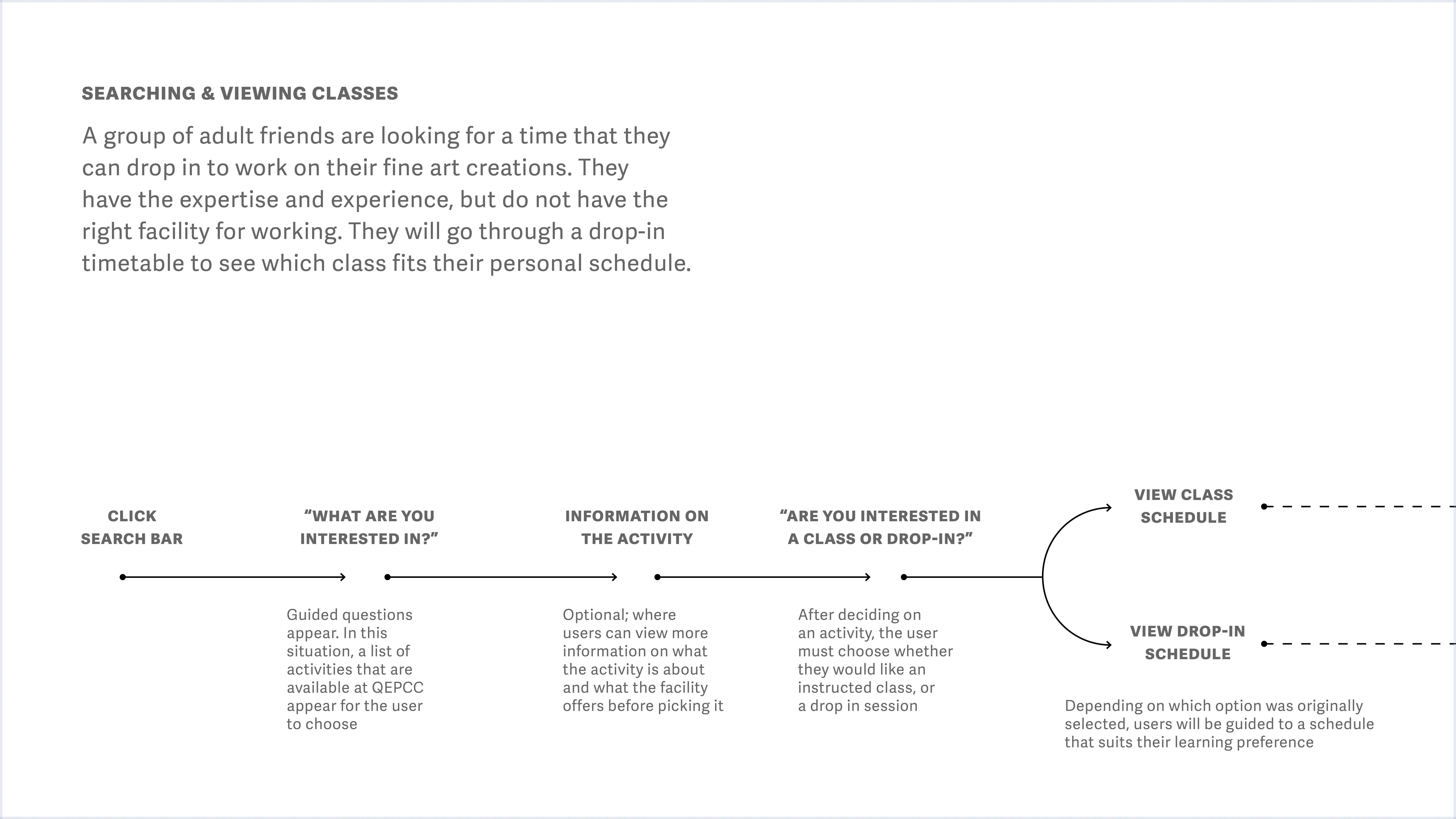
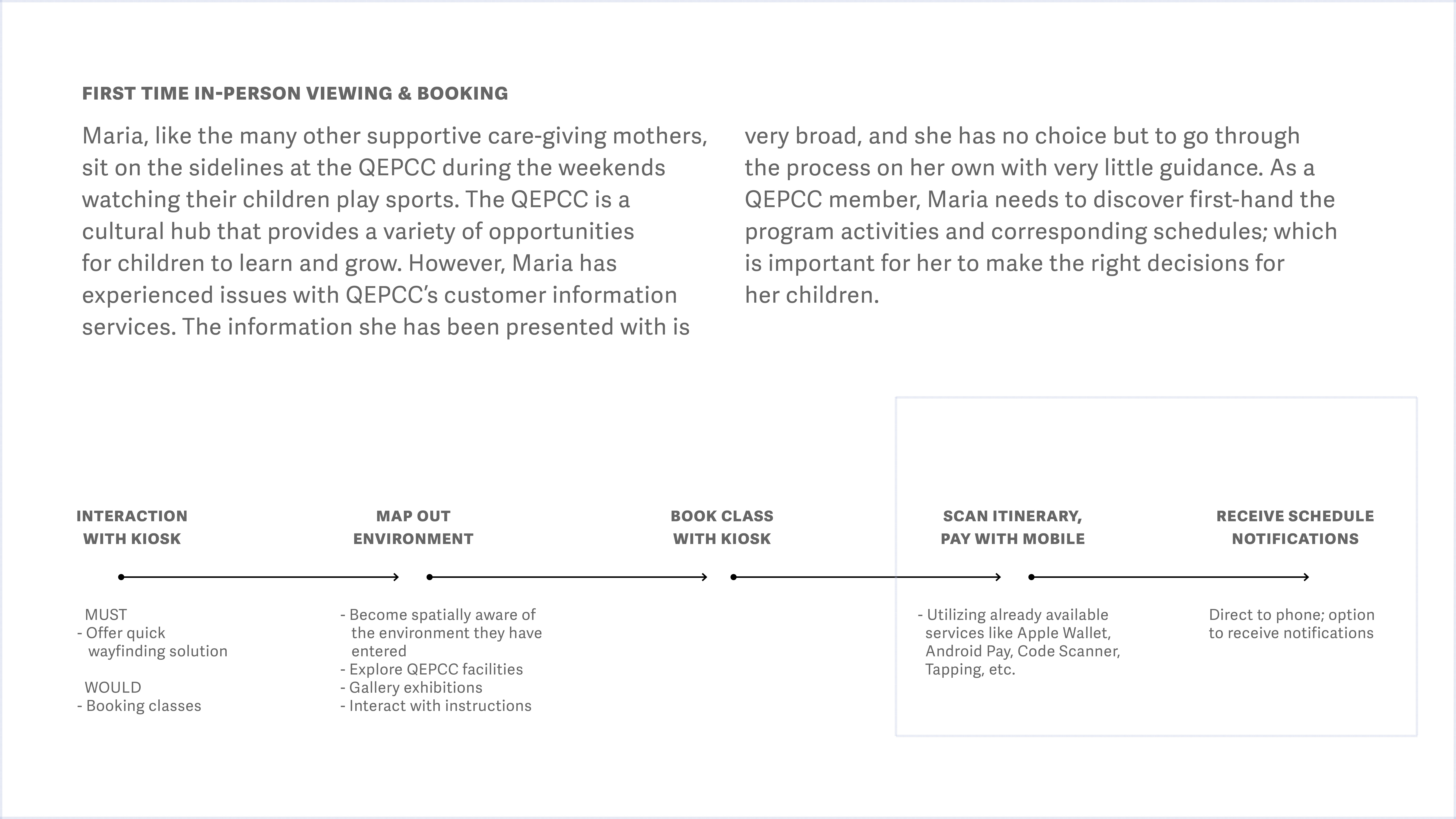
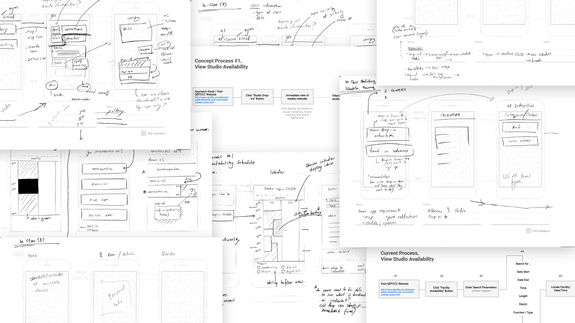
Using fictional scenarios, based off of the target audience we studied, my group was able to pin point how, when, and why one would interact with an on-site kiosk and a website. Developing these flows helped us to mock up a testable prototype to bring back to the QEPCC staff and customers.
Testable Prototypes
Using the Marvel App, an iPad was placed as a kiosk for participants at the QEPCC to test. For the website portion, a laptop was provided.
On-Site User Testing
As a group, we developed the testing brief, scenarios, and scripts for on-site user testing at the QEPCC.
During the testing session, we learned that participants were open to having an on-site kiosk and a website for when they are off-site. Also, users considered mobile and e-mail notifications an important asset for communicating any changes to members before they arrive. They also liked having communicated prices, hidden fees, and any other disclaimers for advanced drop-in studios.
For changes, we learned that users did not react well to scrolling designs and wanted everything to fit above the fold of the screen. Additionally, participants mentioned that they were wary of giving out personal information, such as their cell phone numbers or e-mails, especially seniors. The anxiety of giving out information can be solved by either explaining its necessity to the sign-up process, or simply giving them the option to opt out.
Some of the feedback given was out of the scope of our project. For instance, while users benefited from being shown traffic colours for how many spots were left in the drop-in studios, there was no current system to regulate or calculate this. Additionally, some participants expressed having an interactive map or GPS, as wayfinding was a big issue. Due to lack of time and information provided by the QEPCC, our group could only implement a 2D map system as a section in the kiosk and website.
View Drop-in Studio Availability
Upon walking up to the kiosk, or visiting the website, members can now immediately view studio availability since the schedule is now moved as the home screen. Colours and type size both pass the Web Content Accessibility Guidelines (WCAG) Guidelines.
Register for Programs
Compared to drop-in studio times, members can also learn more and pay for courses in the QEPCC facility. Users have the ability to either pay at the kiosk (there is a credit card machine inserted into the kiosk), or at the front desk. As per testing, the minimum information required for payment, such as name and e-mail, is added for less anxiety as to where the information is being used.
View Facility Map
Members can now stop by at the front entrance and look up facility locations at the kiosk. The map can be accessed at any screen during the scheduling process. Map searching helps narrow down either room number or the type of studio visitors are looking for.
Kiosk Inclusivity
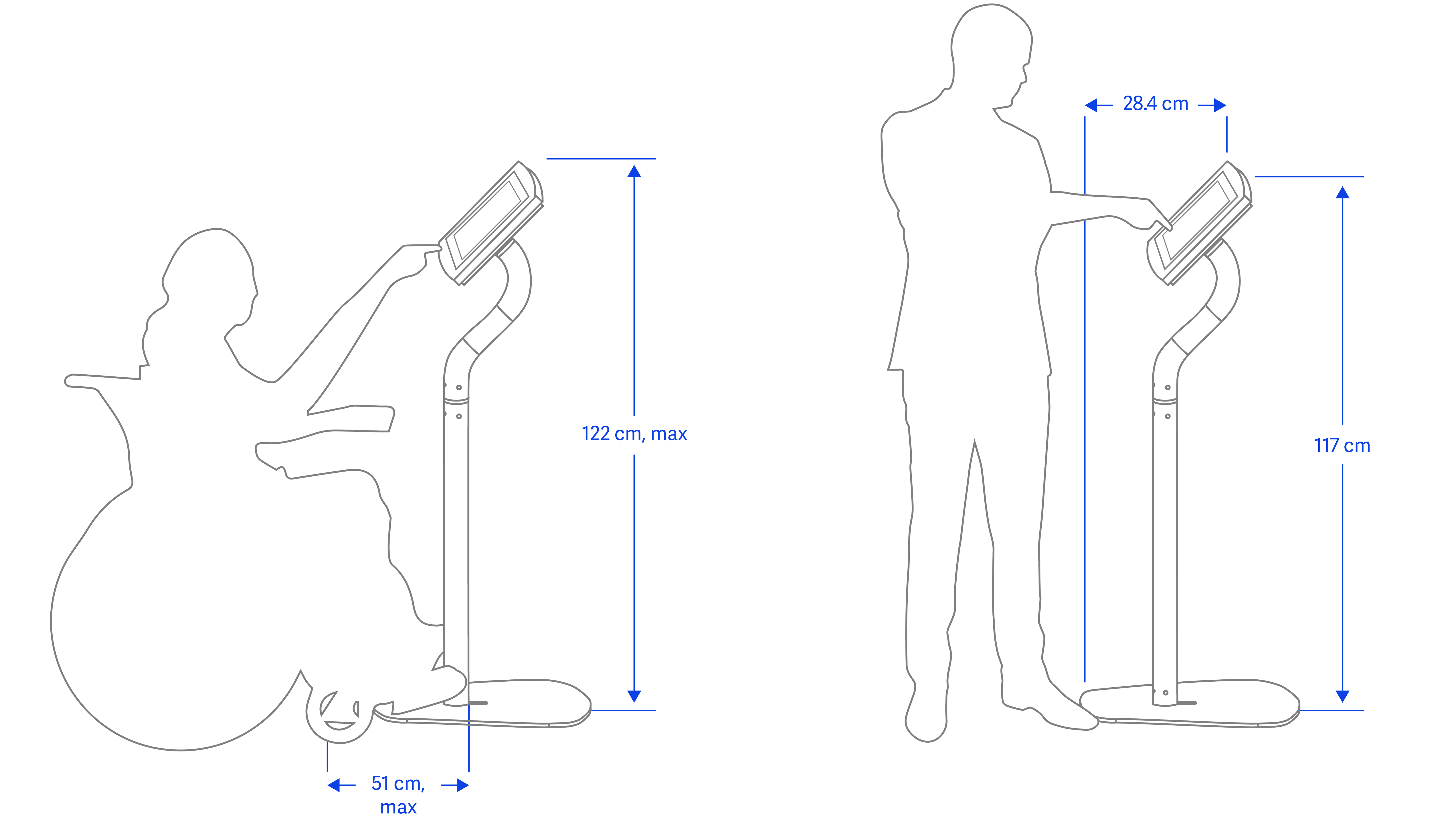
The proposed kiosk design would feature a portrait iPad with a swivel screen. This allows the tablet to reach any necessary height. This accessibility feature allows all members of the QEPCC to feature this on-site feature with ease. The kiosk's height is approachable by the height of the average male, or arm height of members who require wheelchairs or other necessities.
Future Considerations
While our prototype covered the basis for studio drop-ins and developing the kiosk interface, the project could further be enhanced.
Firstly, due to the restriction of time, the website could not be pursued and refined from the testing stage. I would like to revisit the website and implement our findings, as it is necessary to access such information off-site.
I would also like to implement more accessibility features. Our current design only addressed the basics for the kiosk, such as height and having a swiveling tablet. However, the design itself could have had more potential. To improve, I would like ot research various types of impairments and how the kiosk and website could be more inclusive.
-
AcknowledgementsThank you
- The QEPCC
- My Professor, Andrew Hladkyj
- Justin White
- Keturah Stephen
- Zilin Deng
Credits- The QEPCC
